STEAM
UX Case Study:
Redesign the Steam storefront
— CHALLENGE
Redesign an existing website
— ROLE
UX Designer
UX Researcher
— TOOLS
Figma, Illustrator
— DURATION
4 Weeks Flexi @General Assembly UXDI Course
BACKGROUND
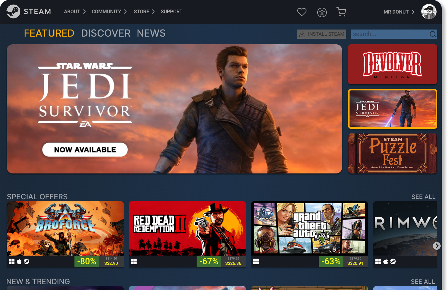
Steam is a massive digital video game storefront with over 35K games and tonnes of features. Released in 2003, it has been the market leader for PC games ever since.
With so much content and features, the storefront can appear daunting to first-timers or casual users.
While major competitors such as Epic Game Store or GOG Galaxy are making their storefront as accessible as possible, the Steam experience has been bogged down by feature bloat and janky navigation.
As an avid gamer and longtime Steam user, I was interested to see what I can do to streamline the experience based on the knowledge learned during the course.
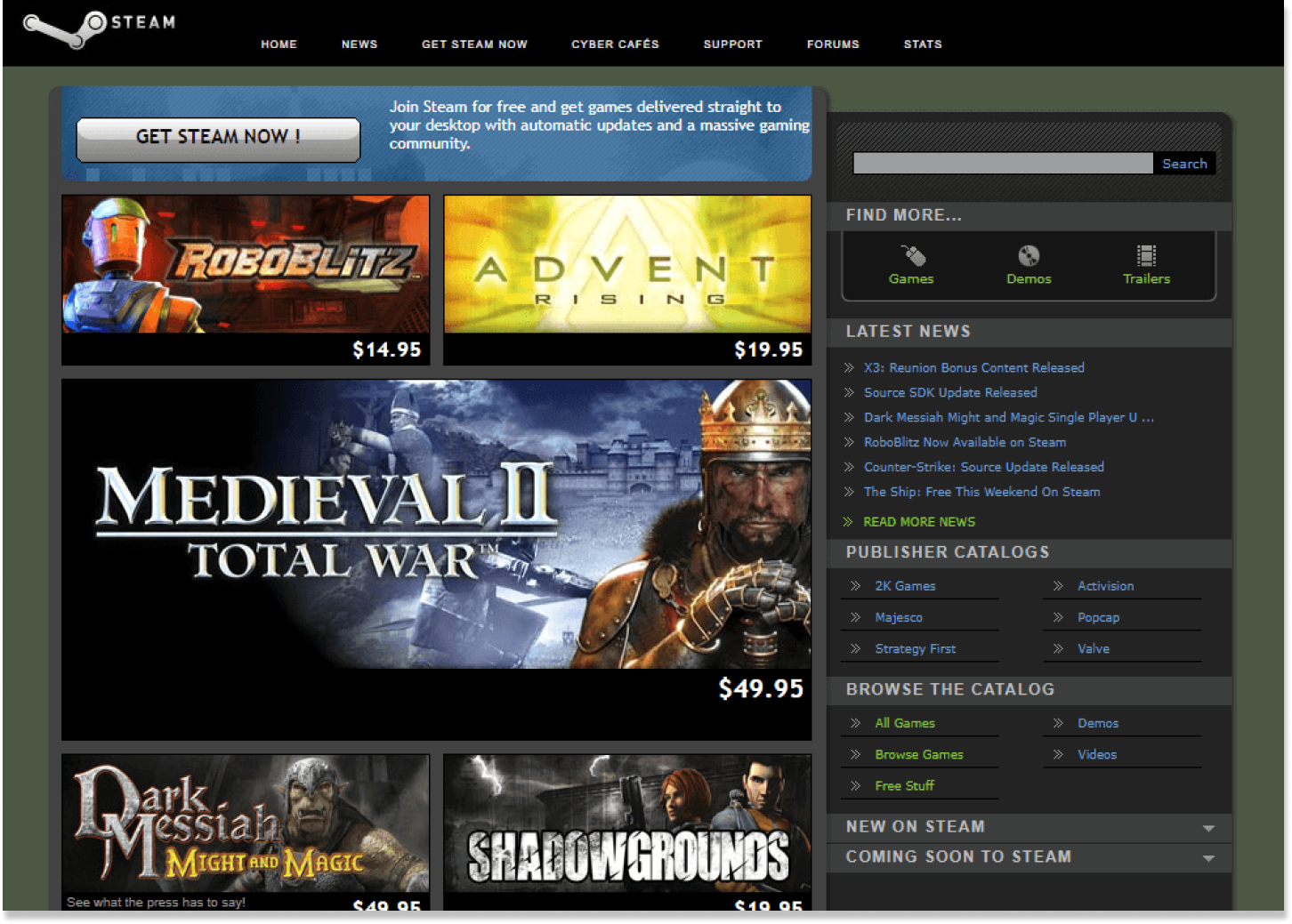
Steam 2006
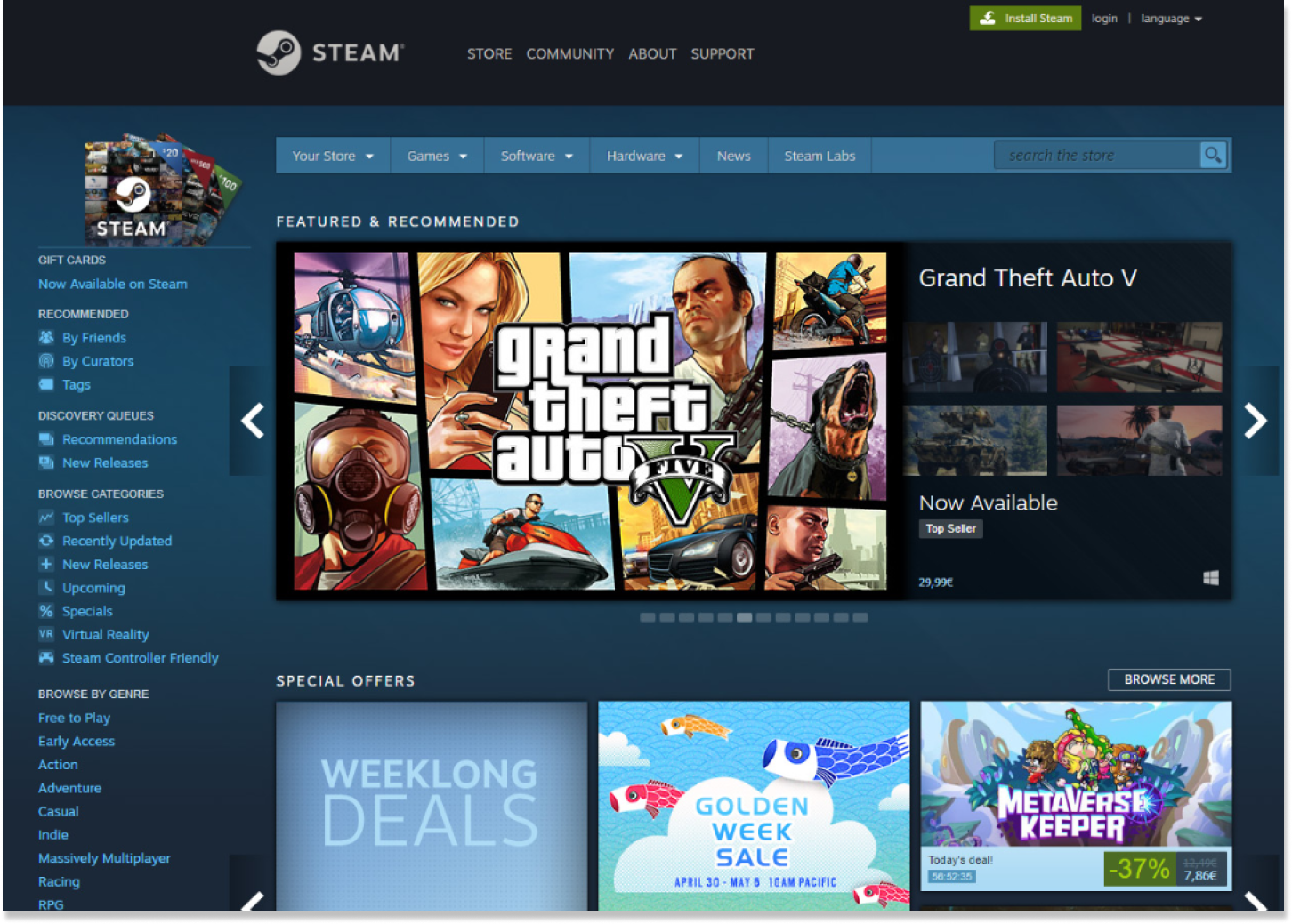
Steam 2020
Design Process
EMPATHY
— Research, User Interview, Usability Testing, Affinity Mapping
DEFINE
— User Persona, How Might We, User Flow
IDEATE
— Card Sorting, Information Architecture, Sketch, Wireframe
PROTOTYPE
— Desktop Prototype, Mobile Prototype
TEST
— Usability Testing, Reflections
EMPATHY
COMPETITIVE ANALYSIS
I start my research with an analysis of some of the direct competitors to Steam. They are Epic Game Store, GOG Galaxy and Xbox Store.

From this analysis, we can see that Steam selling points is their huge game library, customised recommendations for users and the ability to give gifts to other Steam users via digital or gift cards.
USABILITY TESTING
I sought out participants who enjoys gaming to test out the current Steam site. The 4 users are aged from late 30s to early 40s with disposable income.

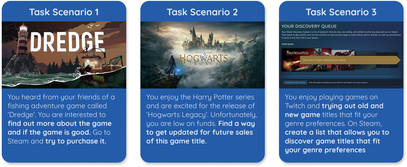
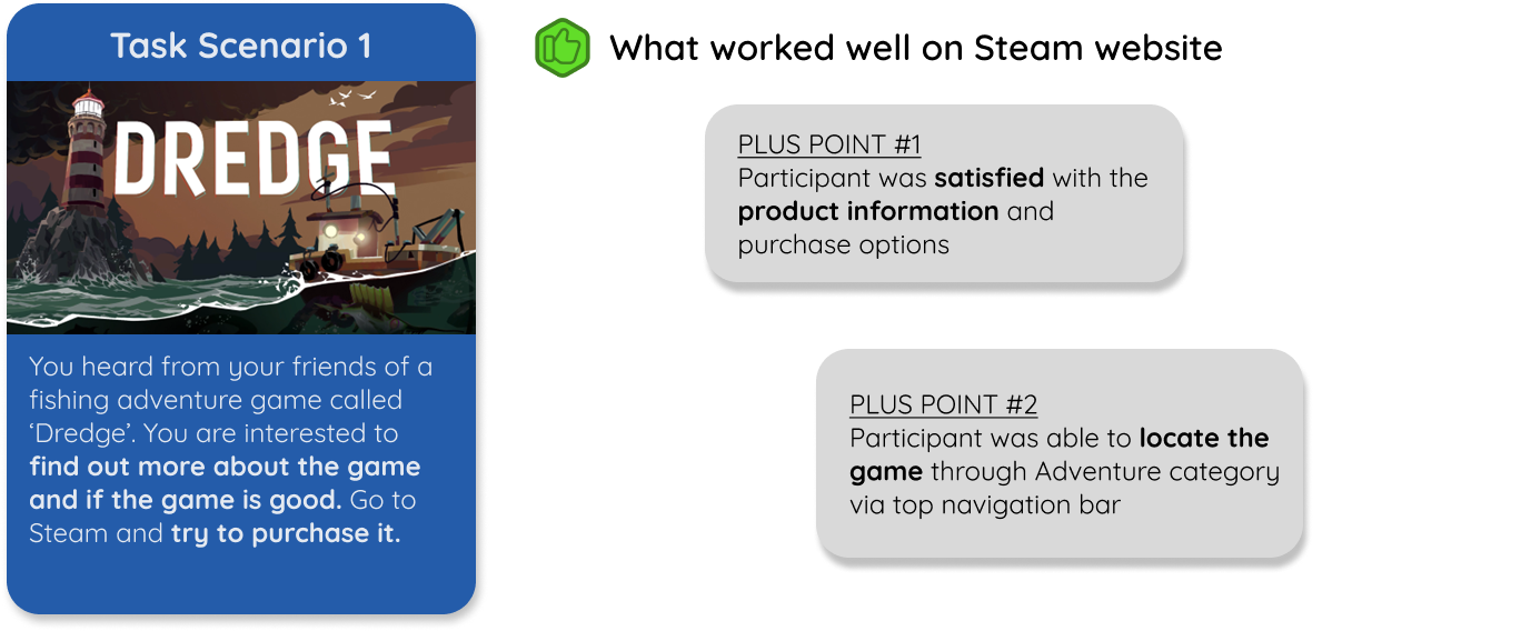
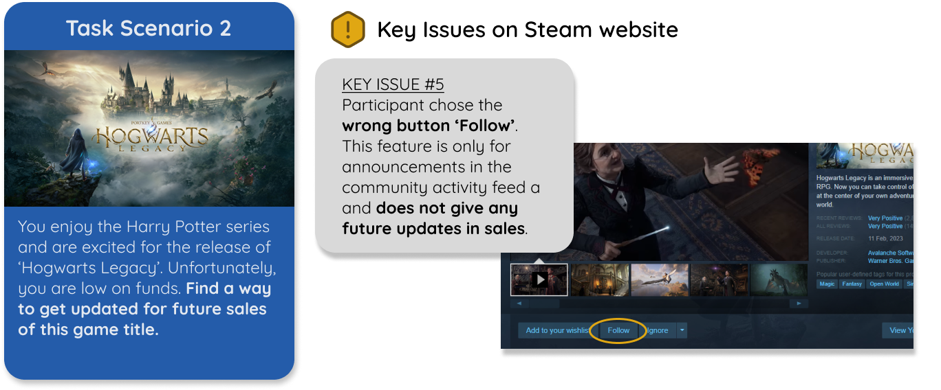
TASK SCENARIOS
I set up 3 Task scenarios for the participants to perform for the Usability Testing session. The objectives:
• Able to navigate the pages easily
• Fulfill the Task specific goal
TASK SCENARIOS FINDINGS
I did follow up user interviews with the participants and collate the findings based on the task scenarios.


SYSTEM USABILITY SCALE
I conducted a System Usability Scale with the participants after they did the 3 Task scenarios. Based on the diagram below, we can deduce that there are areas on the Steam website that can be improved further.

USER INTERVIEWS
The interviews gave valuable insights of what users think about the site. Here are some notable quotes from the interviews.

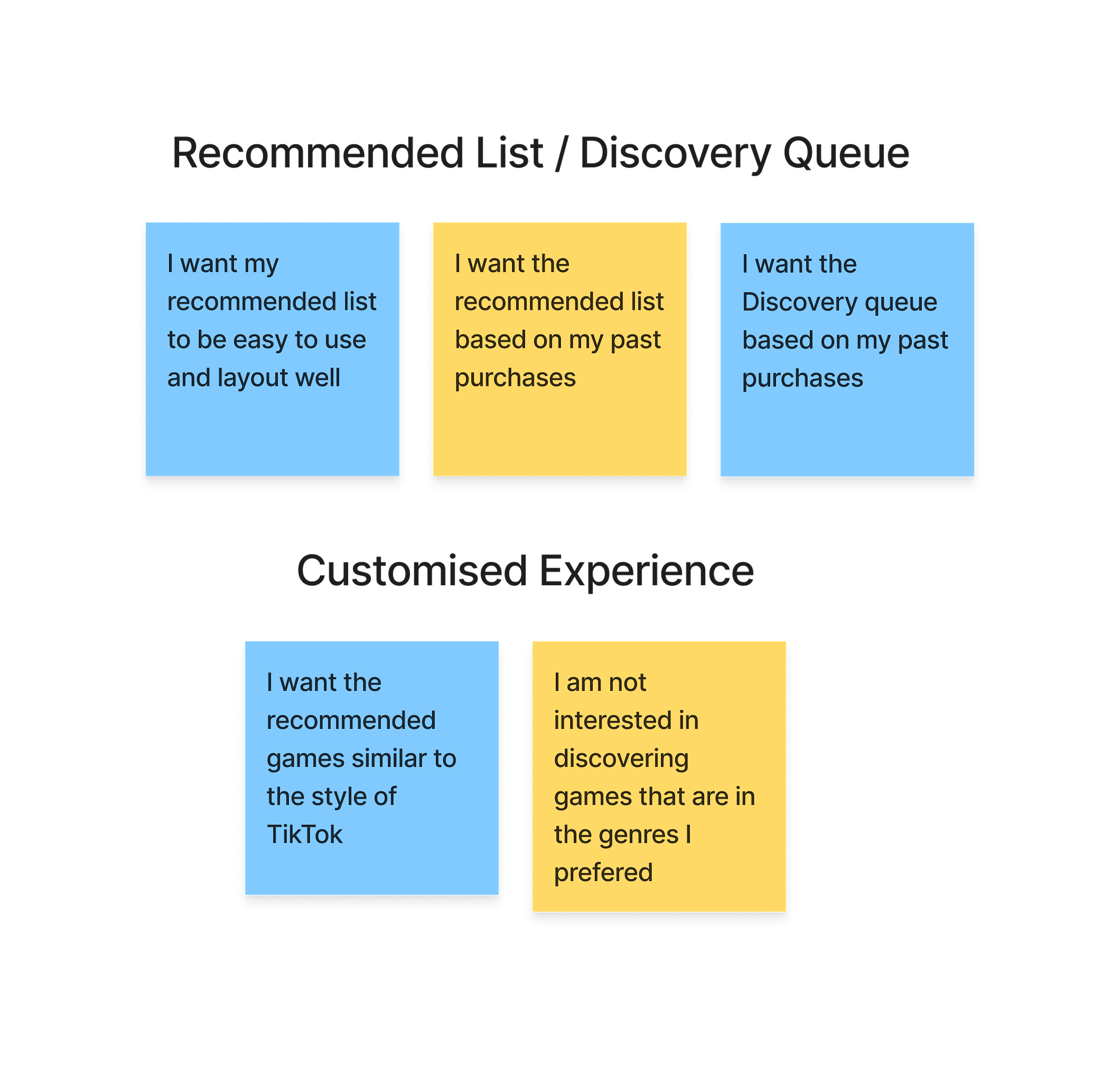
AFFINITY MAPPING
From the interviews, I used Affinity Mapping to map out key concerns and suggestions from the participants into cards. I further grouped them into ‘I Statements’.
I want a simplified navigation system with clear information
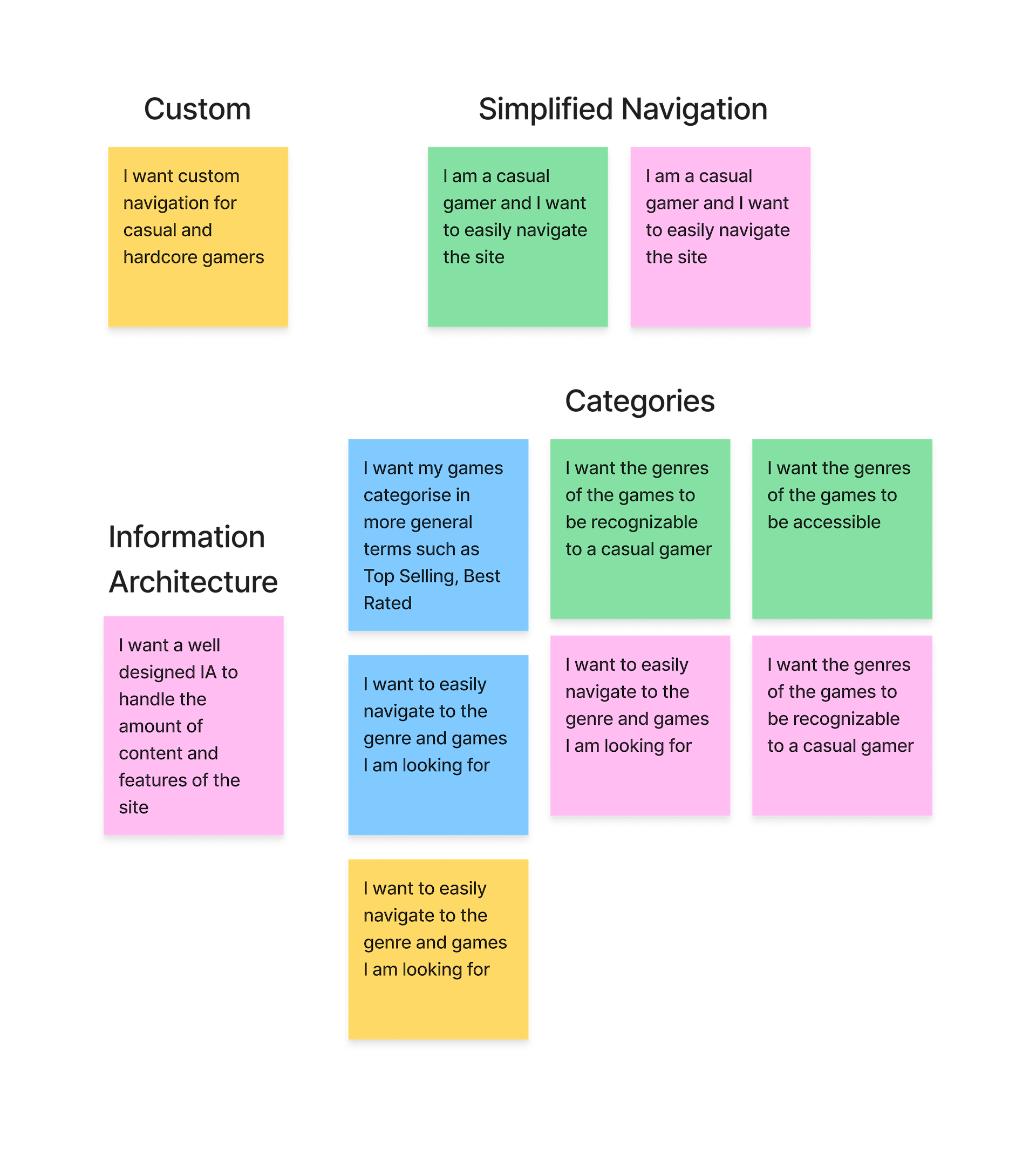
I want an up-to-date Recommendation system based on my preferences and past purchases
I just want features that is useful to me as a casual gamer

DEFINE
INTENDED USERS
Based on the user research, interviews and tests, I identified two personas.


PROBLEM STATEMENTS
From the personas, I derived problem statements to guide me for the solutions for my users.

SOLUTIONS
Robbie and Maria are both heavy consumers with different career and family backgrounds. They have different motivations when purchasing games on Steam.
I am able to derived some possible solutions with How Might We (HMW)framework.
• HMW reduce Feature Bloat for users?
• HMW create simple to understand and accessible navigation for casual users?
• HMW create an intuitive Recommendation list based on user’s preferences and purchases?
• HMW create comprehensive product information that leverage on community and social media?

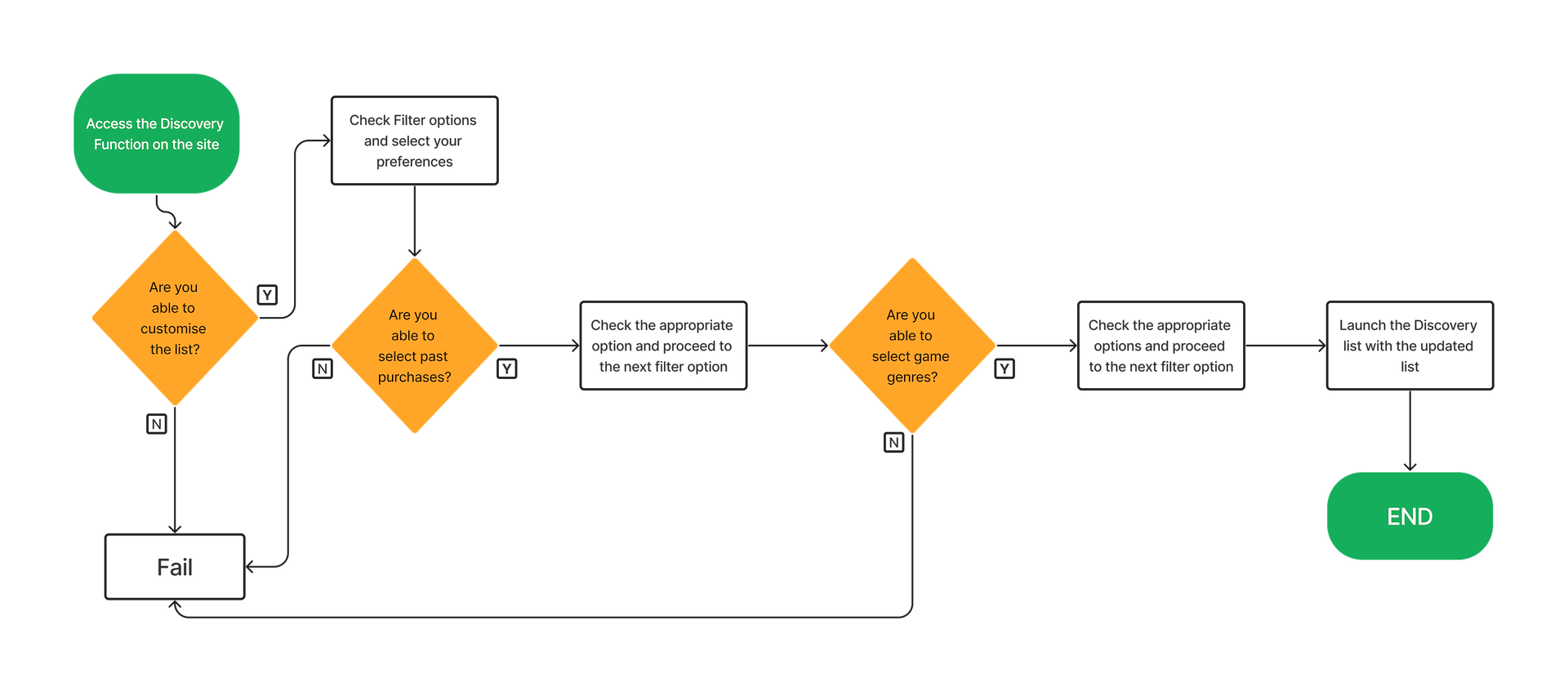
IDEAL USER FLOWS
I came up with 2 User Flows based on the 2 personas. The first user flow look at how users can purchase a game for themselves or gift it to others.

The second user flow shows how users can set up their customised recommendation list.
IDEATE
CARD SORTING
One of the main issues of the current Steam storefront is Feature Bloat that leads to confusion on what the features are for and where certain features are.
What we hope to achieve in the update Information Architecture is to present the features that are clear and usable for casual and hardcore users.
I ran a Card Sorting session with 4 participants and based on the results, create a new site with a more streamline Information Architecture.

INFORMATION ARCHITECTURE
With this new IA, I have reduce the amount of unnecessary features appearing on the homepage. I have also renamed some of the features (Discovery Queue to Discover) to make it more clear for new users.
Some of the features have been been moved around for better visibility and accessibility.

SKETCH & WIREFRAME
I start out with sketches of the screens in Figjam. I proceed to do some low-fi wireframes after that. The iterations done during this process helps to firm up features and user experience that I hope will align with the problem statements.
You can also view the full sketches and wireframes here.

PROTOTYPE
Click on the link here to access the prototype!
The video above go through the user flow process of purchasing a game. In the homepage, I have decluttered the content features and make the user interface more casual user friendly with carousels and pop up mini windows.
The pop up mini windows have 6 seconds videos carousel to give the users a quick preview of the game. The videos are designed for maximum impact in a short attention span.
Click on the link here to access the prototype!
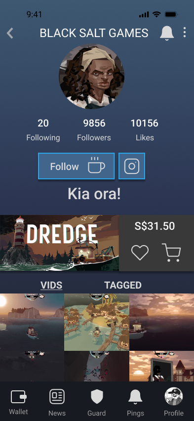
The above video go through the new Discover feature that gives users customisable and smart recommendations. Users can also view gameplay videos from streamers and reviews from other reputable sources in the product page.
MOBILE MOCKUPS
The mobile version of Steam is pretty much a responsive version of the desktop site. I believe this is an area that Steam be presented differently.
Steam has similar streaming services to Twitch called Broadcast. I decided to approach the mobile mockups as a Steam companion that focuses on livestreaming and marketing through TikTok / Instagram like features.
Users can view streamers and developers posting bite size to livestream content. Users can also repost or share the videos. This create more traction to the game.
Wishlisting a game will reflect on the Steam desktop counter part and users can directly purchase the game through the mobile app.
LIVESTREAM
Users can watch livestreams of their favourite games or streamers on the go!

DEVELOPER PROFILE
Check on what developers are working behind the scenes or game updates.
TEST
USABILITY TESTING
I sought out 4 participants to test out my prototype. There were given 2 Task scenerios to perform. The tests were timed and performed asynchronously.

TASK SCENARIOS FINDINGS
The participants filled up the surveys and SUS when they have completed the tasks. Here are the findings after the session.

Overall the prototype did pretty alright as compared to the original SUS score but there is definitely room to improve. Participants were able to complete both tasks successfully with some minor issues.
Here are some feedbacks from the participants.

REFLECTIONS
Overall this project has been a great learning experience for me. I definitely have a greater appreciation on the UX process and how important to get user feedback early.
Though I managed to hit the goals that I set in the beginning, there are definitely areas that I have stumbled and can be designed. What can I do better for the next iteration?
• Better planning when tackling a project as big as Steam
• Create feedback loops so that users are engaged when interacting with the site
• Come up with new colour variations and layouts
• Further usability testings to streamline the site's user experience